Mobile Behavior
The dashboard runs on a phone, but it isn't designed for one. Use it on your phone to glance at numbers between meetings; do real work on a laptop.
This page describes what the phone view actually does, what's worth doing on a phone, and what's faster to handle on a desktop.
JCI is a desktop-first tool with a responsive reflow for narrow screens. There is no native mobile app, no offline mode, and no "mobile mode" toggle. The phone experience is a fact of the product — not a problem to be fixed and not a feature to be oversold.
How the page is laid out on a phone
When the dashboard senses a phone-width screen (under about 640 pixels wide), the desktop sidebar disappears and two pieces of phone chrome appear in its place.
Top — the mobile header
A 56-pixel-tall sticky bar at the very top of the screen. Three things sit in it:
- A hamburger icon on the left. Tap it to open the slide-out nav drawer.
- The JCI logo block in the middle.
- The brand text "Job Cost Intelligence" to the right of the logo.
That's everything the header shows. It does not display the name of the page you're currently on. Once you scroll the page's heading off-screen, the header alone won't tell you whether you're looking at All Jobs or Action Queue or Analytics.
The mobile header shows the JCI brand, not the current page. To confirm which page you're on, glance at the bottom nav — the icon for the active page is highlighted in JCI blue.
Middle — the page content
Everything between the top header and the bottom nav scrolls vertically as one column.
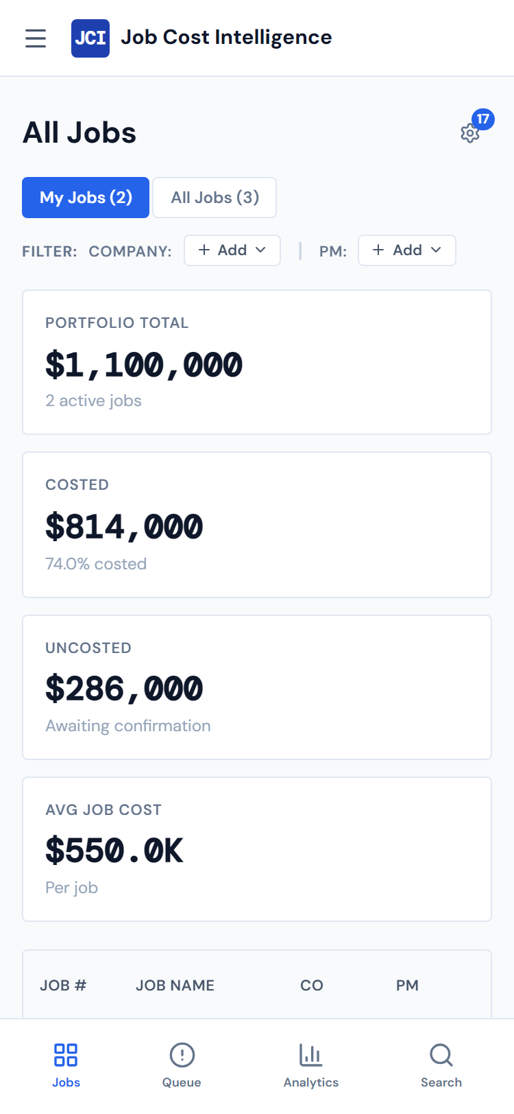
- Scorecards stack one per row. The four-up grid you'd see on a desktop becomes four cards stacked top-to-bottom.
- Every widget runs full width. Charts that sit side-by-side on desktop stack vertically on a phone. The 12-column grid that desktop uses doesn't engage at all below 1024 pixels wide.
- Tables scroll sideways inside their own scroll region. They don't reformat into one-row-per-card layouts (more on this below).
Bottom — the bottom nav
A sticky bar at the bottom of the viewport, always visible on phone. Four tap targets, left to right:
- All Jobs
- Action Queue
- Analytics
- Search (the magnifying glass on the right)
Each has a small icon and a label underneath. The label is small but legible. The active page's icon is highlighted in JCI blue. Tap any icon to jump.
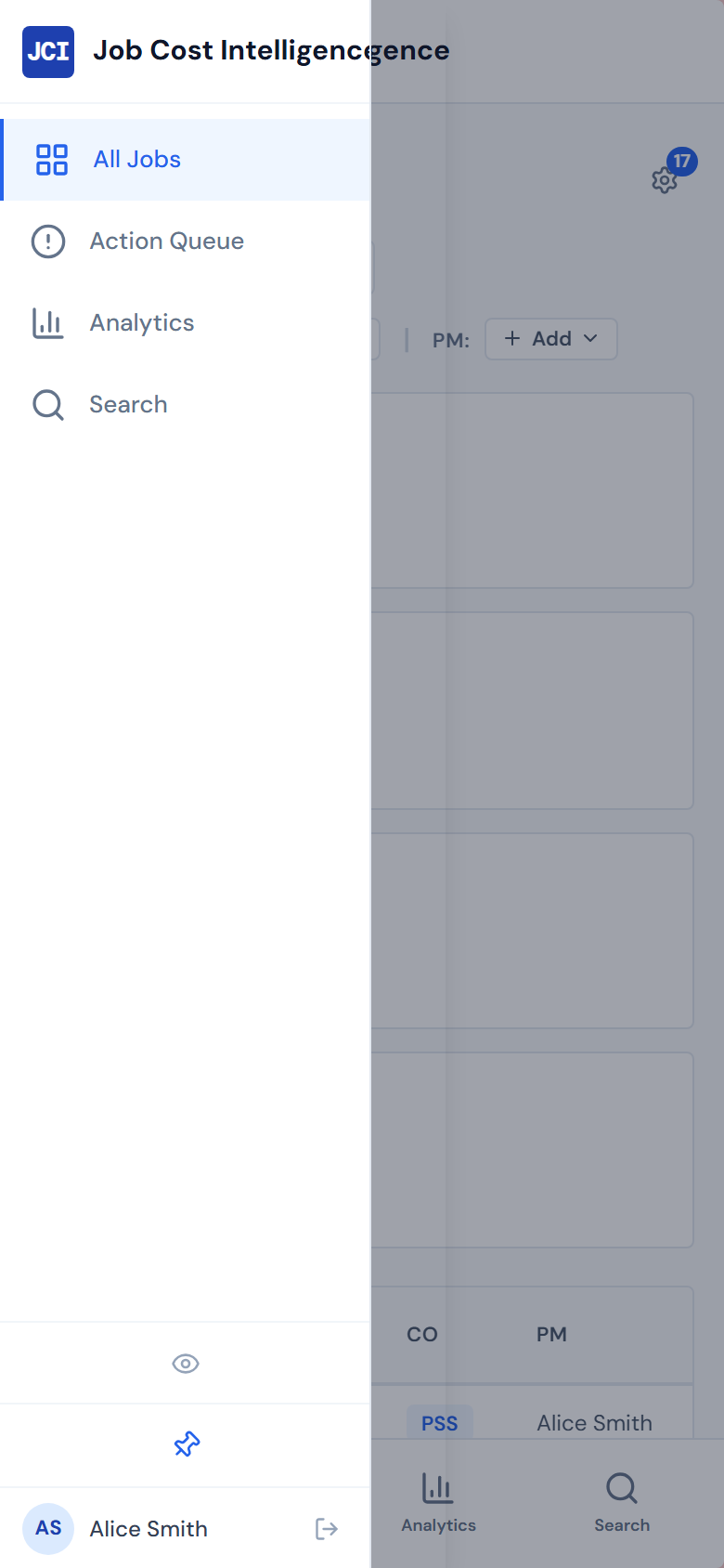
The slide-out nav drawer
Tap the hamburger icon in the top-left to open the slide-out nav drawer. It slides in from the left at about 240 pixels wide (or 80% of the viewport, whichever is smaller).
The drawer contains the same controls as the desktop sidebar:
- The Hide All Widgets toggle (the eye icon)
- The Search button
- The three nav items — All Jobs, Action Queue, Analytics
- The user initials circle at the bottom for sign-out
Three ways to dismiss the drawer:
- Tap any nav item (it navigates and closes the drawer)
- Tap the darkened backdrop to the right of the drawer
- Press Escape if you have a Bluetooth keyboard attached
What works well on a phone
These are the things the phone view genuinely handles well.
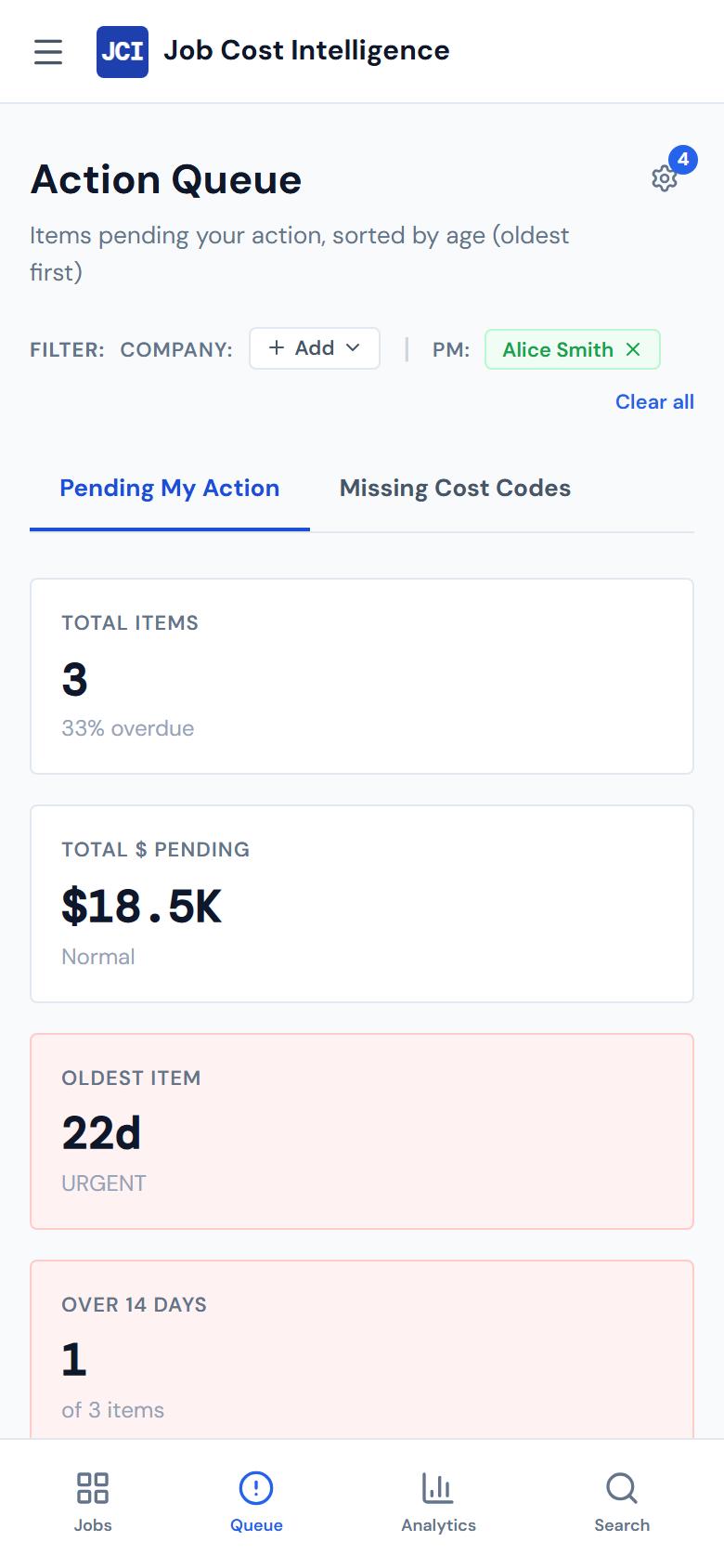
Glancing at a number you remember the location of. "What's the total dollars pending in my Action Queue?" Open the phone, tap Action Queue in the bottom nav, look at the second scorecard. Done in ten seconds.
Looking up a job by name or number. Tap the search icon in the bottom nav, type the job number, tap the result. Search works exactly like it does on desktop. See Global Search for what it actually searches.
Reading something someone sent you a link to. A direct link to a job's detail page opens fine on a phone. The page is long and you'll scroll, but everything is readable.
Switching between the three main pages. The bottom nav is always visible. Going from All Jobs to Action Queue to Analytics is one tap each.
What's awkward on a phone
These are the genuine friction points. They're not bugs — they're the cost of running a desktop layout on a four-inch screen.
Tables scroll sideways
Every data table in the dashboard horizontally scrolls when the screen is narrower than the table. On a 375-pixel-wide phone the All Jobs table runs roughly twice the screen width, so you'll see only the leftmost columns until you scroll the table sideways.
This is true everywhere there's tabular data — the All Jobs table, the queue, PO Detail tables, Budget tables, Equipment tables. None of them reformat into one-row-per-card mobile layouts.
If you've used Stripe, Linear, or other modern admin tools, you may expect tables to reflow into card layouts on a phone. JCI does not — tables keep their column structure and scroll sideways inside a separate scroll region.
The trick is that the table has its own horizontal scroll, separate from the page's vertical scroll. Drag a finger sideways inside the table to reveal the rightmost columns. Drag up or down anywhere outside the table to scroll the page.
Charts are designed for a mouse
Tooltips and legends on the analytics charts were built for a mouse cursor. On a phone, tap once on a data point to show its tooltip and tap somewhere else to dismiss. On crowded charts — the PM Leaderboard, the Vendor Pareto, the spend-trend multiples — the tap target for individual points is small. Best done on a laptop where you can hover.
Analytics gets long
Because every widget runs full width on a phone, the Analytics page becomes a single long vertical scroll. Twelve widgets that fit on one or two desktop screens require many phone screens of scrolling. It works — it's just a lot of motion.
On a long Analytics page, open the slide-out drawer and turn on Hide All Widgets. The widget area collapses and you're left with the underlying job list or queue table — much faster to scan. See Showing and hiding widgets.
Filter chips with X-to-remove are tap-fiddly
The little X on a filter chip is small enough that tapping it sometimes hits the chip itself instead of the X. If you can't land it, use the Clear all control on the filter banner — it's a much bigger tap target.
Inline editing isn't great with an on-screen keyboard
Anywhere the dashboard lets you edit a value in place — Budget Entry being the main one — the on-screen keyboard pops up over the cell you're editing, hiding the rest of the row. Best done on a laptop.
What you cannot do on a phone
Not "harder on a phone." Genuinely cannot.
- There is no native JCI app. What you see in the browser is all there is. Don't go looking in the App Store.
- There is no offline mode. The dashboard needs a live network connection to load. It doesn't cache pages, doesn't work in airplane mode, and doesn't have a "saved for offline" feature.
- There is no mobile-mode toggle. You can't switch to a simplified view; the layout is whatever the screen width produces.
- No swipe gestures. No pull-to-refresh, no swipe-between-tabs, no pinch-zoom on charts. Standard browser tap and scroll only.
- No PO confirming from the phone. This is true on every device — JCI is read-only for PO state, and the actual confirmation happens in Purchase Ordering. Worth re-stating because phone users sometimes assume the desktop version has more capability than the phone version. It doesn't; both are read-only for PO state.
A practical phone routine
If you check JCI from your phone during the day, the move is:
- Tap the Action Queue icon in the bottom nav
- Glance at the four scorecards (totals, dollars pending, oldest item, missing codes)
- Read the first couple of pending items
- Close the tab
Anything beyond that — actually confirming a PO, drilling into Job Detail, running a complex Analytics query — is faster on a laptop. The phone is for situational awareness, not for getting work done. See Action Queue daily workflow for the desktop version of the routine.
When something doesn't fit
A short list of escape hatches when the layout feels cramped.
| Problem | What to try |
|---|---|
| A wide table is cut off | Scroll the table sideways inside its own scroll area (separate from the page scroll) |
| A chart is too crowded to tap | Rotate the phone to landscape — that extra width usually clears the worst of the squeeze |
| The page is a long widget scroll | Open the drawer, turn on Hide All Widgets, jump to the underlying data |
| Something genuinely doesn't work | Open it on a laptop. That's not a workaround — it's the design intent. |
For specific "the dashboard looks broken on my phone" entries, see Troubleshooting.
Related
- Tablet Layout — what changes between phone and desktop in the 640-to-1023 pixel zone
- The Interface — the desktop chrome these layouts adapt away from
- Global Search — works the same on phone as on desktop, opens as a full-screen modal
- Showing and hiding widgets — the Hide All Widgets toggle, especially useful on phone
- Action Queue daily workflow — the desktop routine; on phone it's "glance, not triage"
- Troubleshooting — for cases where something on the phone view looks broken