Tablet Layout
JCI is built for desktop. On a tablet, you'll find most pages workable. In iPad portrait some pages feel cramped; in iPad landscape most feel close to normal. This page tells you which compromises to expect so you don't think the dashboard is broken.
The tablet experience is a best-effort reflow of the desktop layout — not a designed tablet UI. Most pages work for browsing. Some pages, especially Analytics, get long because every widget reflows to full width. If a page feels off, it isn't broken — it's the cost of running a desktop layout on a 768-pixel screen.
The breakpoint reality
JCI has two responsive switches a PM will actually feel.
| Screen width | What you see |
|---|---|
| Below 640 pixels (phones) | Phone bottom nav appears, scorecards stack one per row, every widget runs full width. |
| 640 to 1023 pixels (the tablet zone) | Scorecards become two-up, but otherwise the layout is the phone layout — hamburger menu only, every widget full width, tables scroll sideways. |
| 1024 pixels and above (desktop) | The sidebar appears for the first time, scorecards become four-up, widgets fan out into the multi-column grid. |
The bullet to internalize: the desktop layout only appears at 1024 pixels and above. One pixel narrower (1023) and the sidebar disappears, every widget becomes full width, and you're effectively in the phone layout with two-up scorecards.
That number is non-negotiable — not "around a thousand pixels," but exactly 1024. iPad landscape lands right on it; iPad portrait at 768 sits firmly in the tablet zone.
Navigation in the tablet zone
The awkward part. The desktop sidebar is hidden below 1024 pixels. The phone bottom nav is hidden above 640 pixels. So between 640 and 1023, JCI has no persistent navigation at all.
The only way to get between All Jobs, Action Queue, and Analytics on a tablet is to tap the hamburger icon in the top header. That opens a slide-out drawer from the left, about 240 pixels wide, with the same nav controls a desktop sidebar has — Hide All Widgets, Search, the three nav items, and the user initials at the bottom.
PMs coming from a phone may expect the bottom nav. PMs coming from a desktop may expect the sidebar. On a tablet, neither is there. Tap the hamburger icon in the top-left to open the slide-out drawer.
The drawer always opens in expanded mode on a tablet — full nav labels, not the icons-only collapsed state you may have seen on a desktop. Tap any nav item, tap the dark backdrop, or press Escape on an attached keyboard to close it.
What works well on a tablet
These are the parts of the layout that adapt cleanly into the tablet zone.
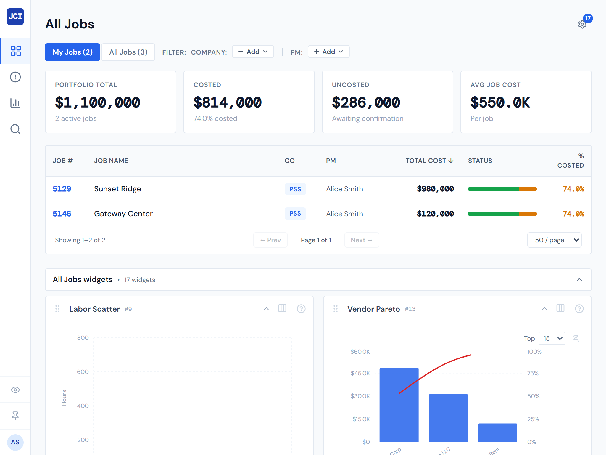
Scorecards reflow to a two-column grid. The four scorecards across the top of All Jobs, Action Queue, Analytics, and Job Detail become a two-by-two grid on tablet rather than the four-up row they show on desktop. Readable, not squished.
The slide-out drawer is touch-sized. The buttons inside are tap targets, not hover targets. Hitting them with a finger works as well as it does with a mouse.
Search opens as a full-screen modal. Tap the search button in the drawer (or press Cmd+K with an attached keyboard) and the search field takes over the screen. Type, see results, tap, navigate. Same flow as desktop.
Reading is fine. Anything text-heavy — job names, PM names, ticket text, job descriptions — reads well at tablet width. The cramped feeling comes from charts and tables, not from text.
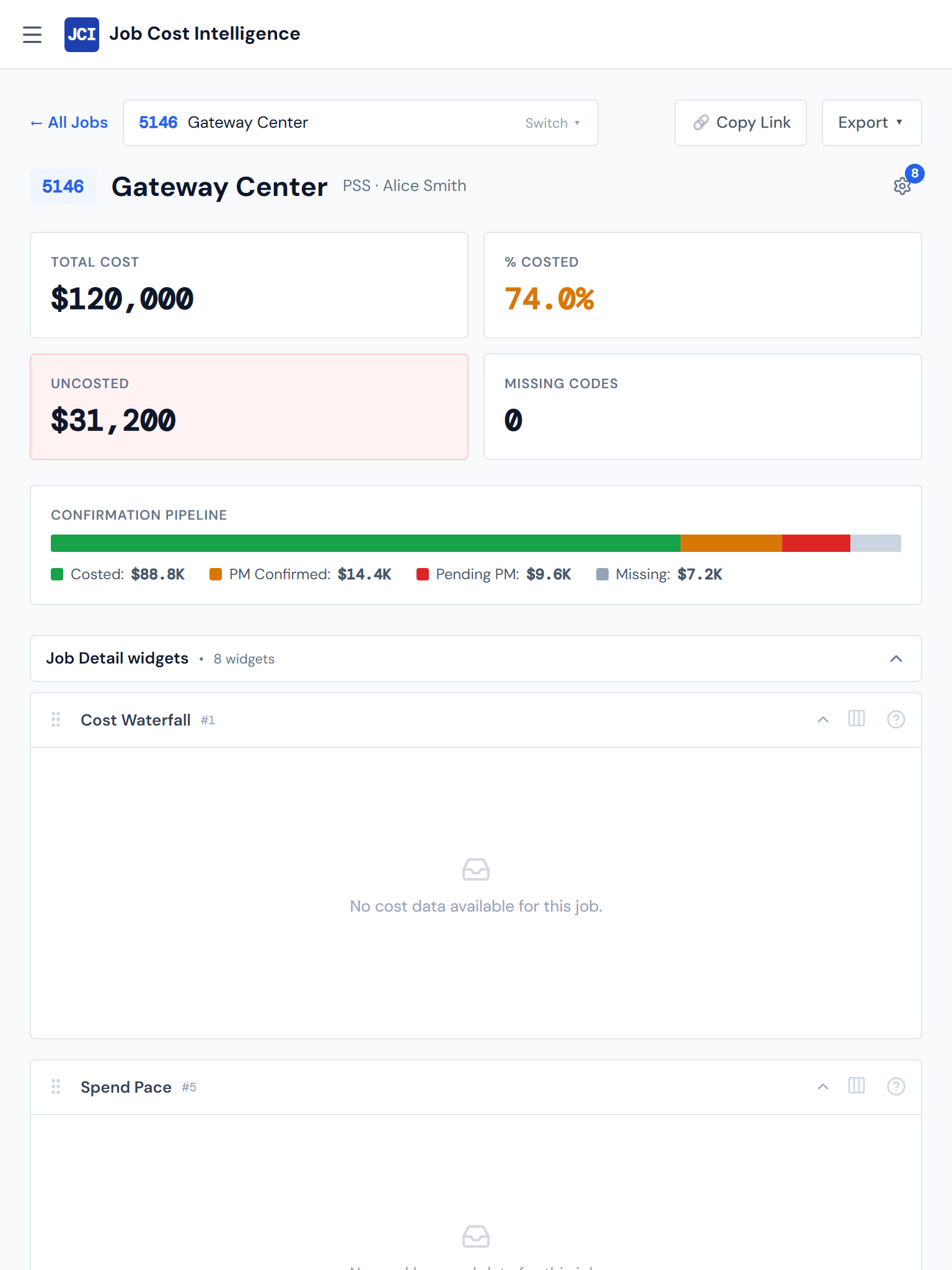
Job Category Cards adapt. On the Job Detail page, the category cards (Concrete, Material, Sub, Equipment, and so on) reflow specifically to a two-up grid on iPad portrait, then to a three-up grid on desktop. This is one of the few places that has a designed tablet layout rather than just falling back to the phone reflow.
What's compromised on a tablet
These are the friction points. Workable, not lovable.
Every widget runs full width
Widgets that sit side-by-side on desktop stack vertically on tablet. The whole multi-column widget grid that desktop uses doesn't engage until 1024 pixels — below that, every widget reflows to full page width. Pages that fit on one desktop screen can take three or four tablet screens of vertical scroll.
The Analytics page is the most pronounced example. Twelve widgets that fan out across two rows on desktop become twelve full-width widgets stacked vertically on iPad portrait. It works — it's just much longer.
On a long Analytics or All Jobs page, open the drawer and turn on Hide All Widgets. The widget block collapses and you're left with the underlying table — much faster to scan. See Showing and hiding widgets.
Tables scroll sideways
Every data table in the dashboard horizontally scrolls when the screen is too narrow. The All Jobs table needs at least 720 pixels of width. On iPad portrait (768 pixels minus padding) it's right on the edge — you may see a small horizontal scrollbar at the bottom of the table. PO Detail, Budget tables, Crew tables, and Equipment tables all behave the same way.
If you're used to admin tools that reformat tables into one-row-per-card on narrow screens, JCI does not. Tables keep their column structure and scroll sideways inside their own scroll region.
Hover tooltips need a tap-and-tap
Tooltips on charts were built for a mouse cursor. On a tablet, tap once to show a tooltip, tap somewhere else to dismiss. Crowded charts — the PM Leaderboard, the Vendor Pareto, the spend-trend multiples — have small per-point tap targets. Workable, just more deliberate than hover-and-read.
The page title isn't repeated in the header
The mobile header at the top of the screen shows only the JCI brand — not the name of the page you're on. Once the page's main heading scrolls off-screen, the header alone won't tell you where you are. Without a bottom nav as a fallback (the bottom nav is phone-only), you have to scroll back up to confirm.
When the desktop layout kicks in
At exactly 1024 pixels — iPad landscape — the dashboard switches into its desktop layout for the first time:
- The sidebar appears on the left
- Scorecards become a four-up row
- Widgets fan out into the multi-column grid
- The full All Jobs table fits without horizontal scroll
For most tablets, rotating from portrait to landscape is the line between "cramped phone layout" and "real desktop layout." If a page feels off in portrait, the first thing to try is landscape.
That extra width is often enough to clear the worst of the squeeze — and at iPad landscape exactly, the dashboard flips into its proper desktop layout.
Keyboard shortcuts on a tablet
If your tablet has an attached keyboard (iPad with Magic Keyboard, Surface, an external Bluetooth keyboard), the Cmd+K / Ctrl+K search shortcut still works the same as on desktop — press it from anywhere to open the search modal. On a touch-only tablet, tap the search button in the slide-out drawer instead. See Keyboard shortcuts for the full list.
Recommended use
A tablet works for browsing, not for sustained data work.
The Action Queue triage routine is fine on iPad if you have ten minutes between meetings. Reading through your jobs list, checking Action Queue scorecards, opening a Job Detail page to read its scorecards and category cards — all reasonable.
Building a complex filtered view in Analytics, scrolling sideways through the All Jobs table looking for a specific column, or doing real budget entry is faster on a laptop. Use a tablet to check status; use a laptop to do work.
Things the tablet view does not do
Not just "harder on tablet." Genuinely does not exist.
- No tablet-mode toggle. There is no setting that switches the dashboard into a tablet-optimized view. The layout is whatever your screen width produces.
- No native iPad app. What you see in Safari is all there is. Don't look in the App Store.
- No touch gestures beyond tap and scroll. No swipe-to-dismiss, no pull-to-refresh, no pinch-zoom on charts.
- No widget width selection effect below 1024 pixels. The widget settings panel lets you set per-widget widths on desktop, but those choices don't take effect on tablet — every widget is full-width regardless. See Widget settings panel for what does and doesn't apply at tablet sizes.
Related
- Mobile Behavior — what changes below 640 pixels (phone behavior)
- The Interface — the desktop chrome these layouts adapt away from
- Showing and hiding widgets — the Hide All Widgets toggle is especially useful on tablet, where every widget is full-width
- Widget settings panel — widget width selection only applies at 1024 pixels and above
- Keyboard shortcuts — Cmd+K and friends, work on tablets with attached keyboards