Collapsing Widget Sections
Each page that hosts widgets wraps its widget grid in a clickable section header. Click the header once and the entire grid folds away; the page body underneath jumps up to fill the gap. Click again and the widgets come back in the same positions, with the same widths, and with the same per-widget collapse states they had before.
The whole width of the header bar is the toggle. You don't have to aim for the chevron.
Where the section header lives
The section header is the strip just below the page title, before the data table or other page content begins.
- All Jobs, Analytics, Action Queue — one section header at the top of the page.
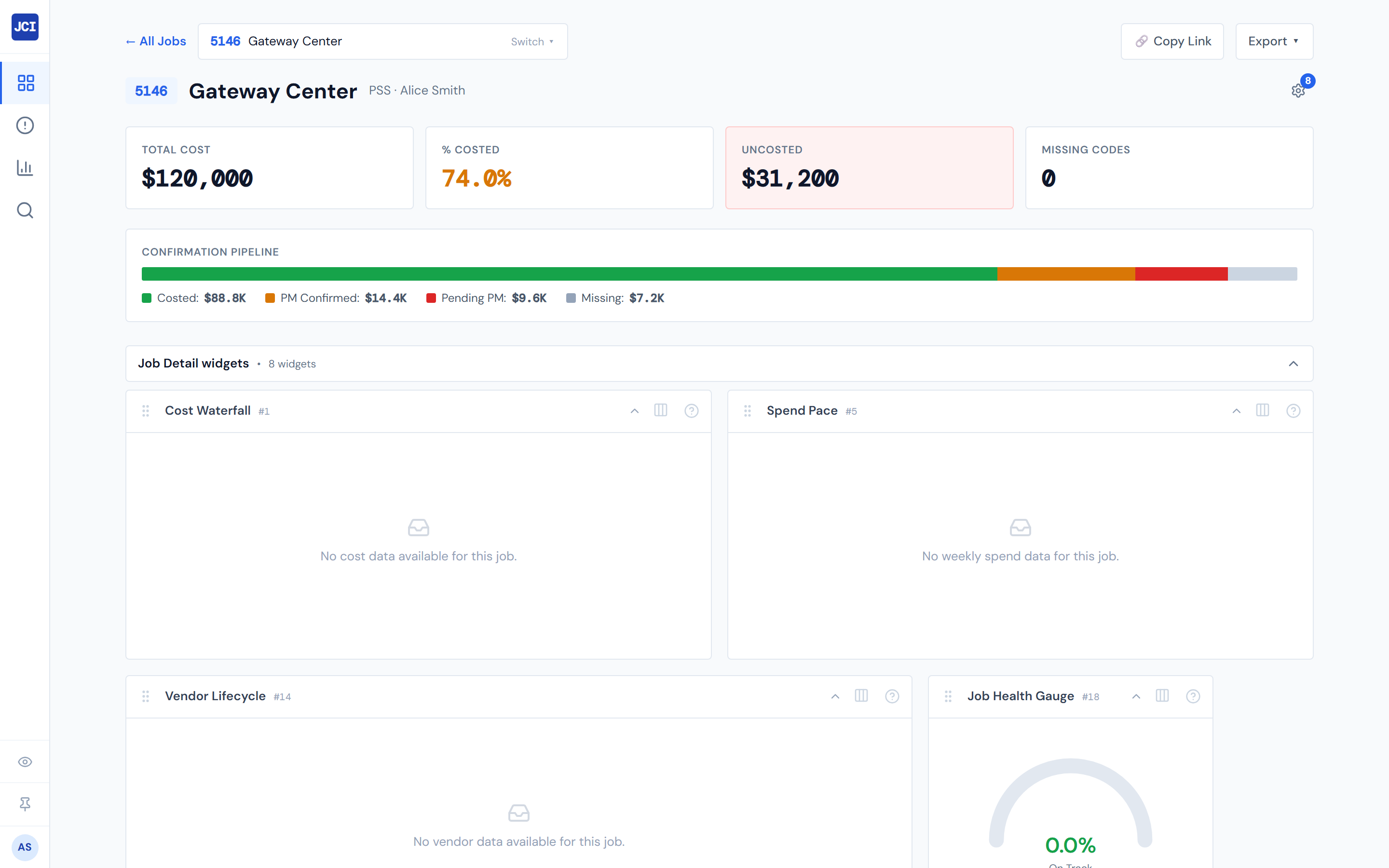
- Job Detail (main tab) — one section header titled "Job Detail widgets" between the page header and the main tab bar.
- Job Detail › Field Data — a second section header titled "Field Data widgets" appears below the first when the Field Data tab is active.
- Job Detail › Budget — a second section header titled "Budget widgets" appears below the first when the Budget tab is active.
Job Detail can stack up to three section headers above the main tab bar at once. Each one folds independently of the others.
What's in the header
Three pieces:
- The section title — "All Jobs widgets," "Job Detail widgets," "Field Data widgets," "Budget widgets," etc.
- A small bullet separator.
- The widget count — "3 widgets" or "1 widget."
On the right side of the bar, a chevron points up when the section is expanded and down when it's collapsed.
How collapsing works
Click anywhere on the header bar. The chevron flips, the widgets below disappear, and the page body underneath jumps up. Click the header again to expand — the widgets re-appear in the same positions, widths, and per-widget collapse states they had before.
What collapsing preserves
Section collapse only hides or shows the section as a unit. It does not change:
- Which widgets are switched on or off.
- The order of widgets in the grid.
- Each widget's width.
- Any widget's per-widget collapse state (a widget you'd already individually collapsed before stays collapsed when you re-expand the section).
- Pinned controls inside widgets.
This is the non-obvious behavior worth flagging: collapsing the section does not "reset" the widgets when you expand again. If you'd individually collapsed a widget down to its header line earlier, it stays that way after you fold and unfold the whole section.
Group collapse, per-widget collapse, and Hide All — three mechanisms
Three different controls can fold or hide widgets, and they each do something different. Pick the one that matches what you want:
| Action | What it folds | Where you click |
|---|---|---|
| Group collapse (this page) | Every widget on this surface at once | The section header at the top |
| Per-widget collapse | One widget's body, leaving the title bar visible | The widget card's own title or chevron |
| Hide All Widgets | Every widget on every surface | The sidebar Eye icon, or the Hide All button at the bottom of the customize panel |
Group collapse, per-widget collapse, and Hide All are not the same control. Group collapse is one section on one page; per-widget collapse is one widget; Hide All is global. See Showing and Hiding for the Hide All deep-dive, and Widget Settings Panel for the per-widget collapse mechanism.
Empty surfaces don't render a section header
Some preset-and-page combinations are empty by default — for example, the Executive preset doesn't enable any widgets on Job Detail. When a surface has zero enabled widgets, the section header doesn't appear at all. The page goes straight from the page title to the data table or tab bar with no widget area in between.
If you don't see a section header on a surface and you'd expect one, open that page's gear, switch on at least one widget that's eligible, and the header will appear with it.
Hide All wins
If Hide All is on (from the sidebar Eye icon or the panel footer), every section header on every page is hidden — even sections that were expanded. The state of each section's collapse is preserved through a Hide All cycle: turn Hide All off and the headers return in whichever expanded or collapsed state you had them in before.
See Showing and Hiding for the Hide All rules and the precedence story.
Persistence
Each section's expanded or collapsed state is saved automatically, per page, and follows you across sessions and devices. Collapse "Field Data widgets" on Job Detail today and it stays collapsed the next time you visit any job's Field Data tab tomorrow on a different machine.
Keyboard and screen reader
The section header is a real button. Tab to it, press Enter or Space to toggle. Screen readers announce the section title and the current expanded or collapsed state.
Why you might use this
- You want to focus on the data table or PO list and the widgets above it are taking up real estate. Collapse the section.
- You want the widgets back. Click the header to expand them.
For a permanent "I never want to see these widgets again on this page" state, use the per-widget toggles in the customize panel instead — see Widget Settings Panel.
Related
- Showing and Hiding — Hide All and per-widget hide.
- Widget Settings Panel — the per-widget collapse mechanism (the chevron on each widget's title line).
- Reordering and Pinning — what's preserved across collapse cycles.
- Presets — explains the preset-and-page combinations that are empty by default.
- Job Detail Overview — context on Job Detail's three-section layout.