Widget Settings Panel
The customize panel is the single place where you do most widget management:
- Switch individual widgets on or off for the page you're on.
- Resize a widget to one of five widths.
- Pick a different role preset.
- Reset your layout to your role's preset.
- Hide every widget on every page.
- See which widgets are unavailable on the current page and which pages they DO appear on.
This is the chapter's reference page. Other widget pages link back here for the panel-specific UX.
Open and close
Click the gear icon in any page header. A side panel slides in from the right.
- Close it with the X button at the top of the panel.
- Or press Esc.
- Or click anywhere in the dimmed page area outside the panel.
The page underneath stays visible (you can see your layout in real time as you change settings) but the dimming overlay tells you the panel has focus.
"Editing: Page Name"
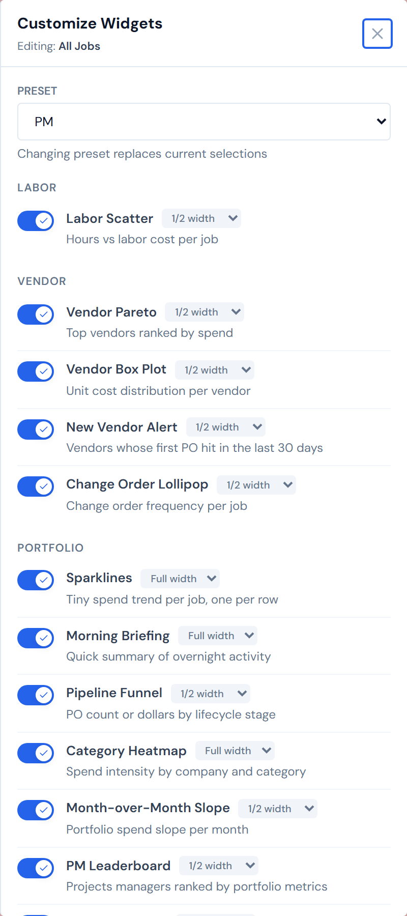
The subtitle at the top of the panel — for example, "Editing: All Jobs" — tells you which page the panel is editing. The gear is per-page: opening the gear on Analytics shows you Analytics's widgets; opening it on All Jobs shows you All Jobs's. That's the intended scope.
Job Detail's gear is tab-aware
On Job Detail, the same gear icon scopes to whichever main tab is active.
- On the main tab, the subtitle reads "Editing: Job Detail."
- On the Field Data tab, it reads "Editing: Job Detail › Field Data."
- On the Budget tab, it reads "Editing: Job Detail › Budget."
Switch tabs and the badge count on the gear changes with you.
The same gear icon scopes to a different surface depending on which Job Detail main tab you're on. The "Editing:" subtitle is your truth label.
The preset dropdown
A single dropdown at the top of the panel offers three presets:
- PM
- Ops Manager
- Executive
A fourth entry — Custom — appears in the dropdown once you've changed anything off your role's default, but it's disabled. Custom is a status, not a choice. See Presets for the full preset rules.
Picking a different preset replaces your layout on every surface, not just the page you're editing.
The widget list
Below the preset dropdown, the panel shows every widget in the catalog as a row. Rows are grouped by category — Cost Tracking, Labor, Vendor, Portfolio, Analytics, Billing, Field Ops, Alerts.
Within each category, the panel sorts widgets two ways:
- Eligible widgets first — widgets that can appear on the current page, with a working toggle and a width picker.
- Ineligible widgets second — widgets that can't appear on this surface. They show up greyed out, with an italic hint reading "Available on Page Name" so you know where you can switch them on.
Below the category groups, a thin divider with the label "Available on other pages" separates the categories from a final greyed group of widgets that have no eligibility for this page at all.
Today every category is always expanded — you scroll past the categories you don't care about. Per-category collapse may arrive later but is not in the product today; don't expect a chevron on each category.
The toggle switch
Each row has a pill-style switch on the left.
- On — brand-blue, knob to the right, check icon visible. The widget appears in the page's grid.
- Off — grey, knob to the left. The widget is hidden for this page.
Click the switch to flip. The change saves immediately and the widget appears or disappears from the grid behind the panel.

For ineligible widgets, the toggle is greyed and inactive. The "Available on Page Name" hint tells you where to go.
This is intentional, not a bug. Some widgets only make sense on certain surfaces — Cost Waterfall on Job Detail, Spend Sparklines on All Jobs and Analytics, and so on.
The width picker
Beside the widget name on each eligible row, a small dropdown shows the current width:
- 1/4 width
- 1/3 width
- 1/2 width
- 2/3 width
- Full width
Change the value to resize. The same picker is also accessible on the widget card itself, in the card's header. The two stay in sync.
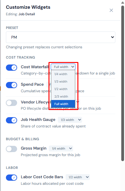
Width is per-widget, not per-page
This is the most-confused behavior in the panel.
If a widget appears on more than one surface — say, the Vendor Pareto on All Jobs and Analytics — the width you pick here applies on both. Show/hide and order are per-page; width and per-widget collapse are per-widget. Changing width on one page changes it everywhere the widget appears.
The same rule applies to per-widget collapse (the chevron in a widget's own title bar that hides just that widget's body): if you collapse the Cost Waterfall card on Job Detail, that collapse follows the widget to any other surface where it's enabled.
The footer — Hide All and Reset to Default
Two buttons at the bottom of the panel.
Hide All Widgets / Show All Widgets
The same global toggle as the sidebar Eye icon. Click to hide every widget on every page; click again to bring them back. The button text and the sidebar icon stay in sync — turn it on from one and the other reflects the change.
With Hide All on, every widget is hidden regardless of the per-widget switches in this panel. The switches still function — they're just invisible until Hide All is off. See Showing and Hiding.
Reset to Default
Reverts your layout to your role's preset on every page — not just the page you're editing.
Reset reverts every surface to your role's preset. If you're a PM who applied the Exec preset and customized from there, Reset takes you all the way back to the PM preset, not back to Exec. See Presets for the full rule.
The gear's badge
The number on the gear icon is the count of widgets currently enabled on the page the gear is attached to. It updates live as you toggle. On Job Detail, switching tabs re-scopes the gear; the badge count changes with the tab.
What's stored where
A quick mental model for what travels with the widget vs. what stays per-page:
| Setting | Where it's stored |
|---|---|
| Show/hide a widget | Per-page |
| Order of widgets | Per-page |
| Section collapse (the row of widgets) | Per-page |
| Width of a widget | Per-widget (shared across every page where the widget appears) |
| Per-widget collapse (the chevron on the card title) | Per-widget |
| Pinned controls inside a widget | Per-widget |
See Reordering and Pinning for the per-page rules around order, and Showing and Hiding for show/hide.
Keyboard and accessibility
The panel is a real dialog. When you open it:
- Focus moves to the close button.
- Tab cycles within the panel — you can't tab back out into the page underneath.
- Esc closes the panel.
Each row's switch is a real toggle button (role="switch"), so screen readers announce it correctly. The width picker is a real dropdown. Keyboard users get the same affordances as mouse users.
Esc closes the panel. Tab cycles inside the panel. Each switch and dropdown is keyboard-operable.
Common questions
"Why doesn't this widget have a toggle?"
It's ineligible for this page. The widget is greyed out and the row shows an "Available on Page Name" hint pointing you to the surface where you can switch it on.
"Why did changing width on All Jobs also change it on Analytics?"
Width follows the widget, not the page. See the width-is-per-widget warning above.
"Why doesn't the panel show categories I can collapse?"
It doesn't yet. Today every category is always expanded. Per-category collapse may ship in a future release.
"I don't see the section header at all on this page."
If a surface has zero enabled widgets, the section header is suppressed entirely. Toggle one widget on for that page and the header reappears. See Collapsing Widget Sections.
Related
- Showing and Hiding — Hide All and per-widget hide.
- Reordering and Pinning — drag-to-reorder and pinning a widget control.
- Presets — preset contents per surface, plus what survives a preset switch.
- Collapsing Widget Sections — folding the whole row of widgets at once.
- Cross-Widget Drill-Down — clicking a chart to filter the rest of the page.
- Widget Catalog — what each widget actually does.
- Companies and Access — how the PM, Ops, and Exec roles are set in the PM directory.
- Data Refresh Rates — refresh windows for the data behind every widget.